

Unconventional Sleep Aids Are in Vogue
It used to be that if you needed a sleep aid, you went straight to the medicine aisle, but things are rarely that simple anymore. They are, however, a lot more fun: you can have a midnight snack with a Good Day Chocolate sleep supplement, or a nightcap with Kin Euphorics’ Dream Light, and still sleep with a clear conscience. The latter, with its apothecary-meets-mixology branding by RoAndCo, includes ingredients like melatonin, reishi mushroom extract, and the amino acid L-Theanine, helping the drink adapt to an individual’s nighttime needs “like a thermostat.”
The same adaptive nature could be said of the food and beverage industry as a whole, which has found unique ways to tap into the collective anxiety and restlessness of the past year. The concepts for sleep-oriented products like Nightfood and PepsiCo’s Driftwell both predated the pandemic (the latter came out of a 2019 internal company pitch contest), but they have each used design to appeal to a growing attention on rest and relaxation. These and the many other products like them aren’t quite medicine, but they’re not just something to idly sip or snack on either. Instead, they’re part of a growing category of products known as “functional food,” and their function, as conveyed by their soothing design, is to chill you out.
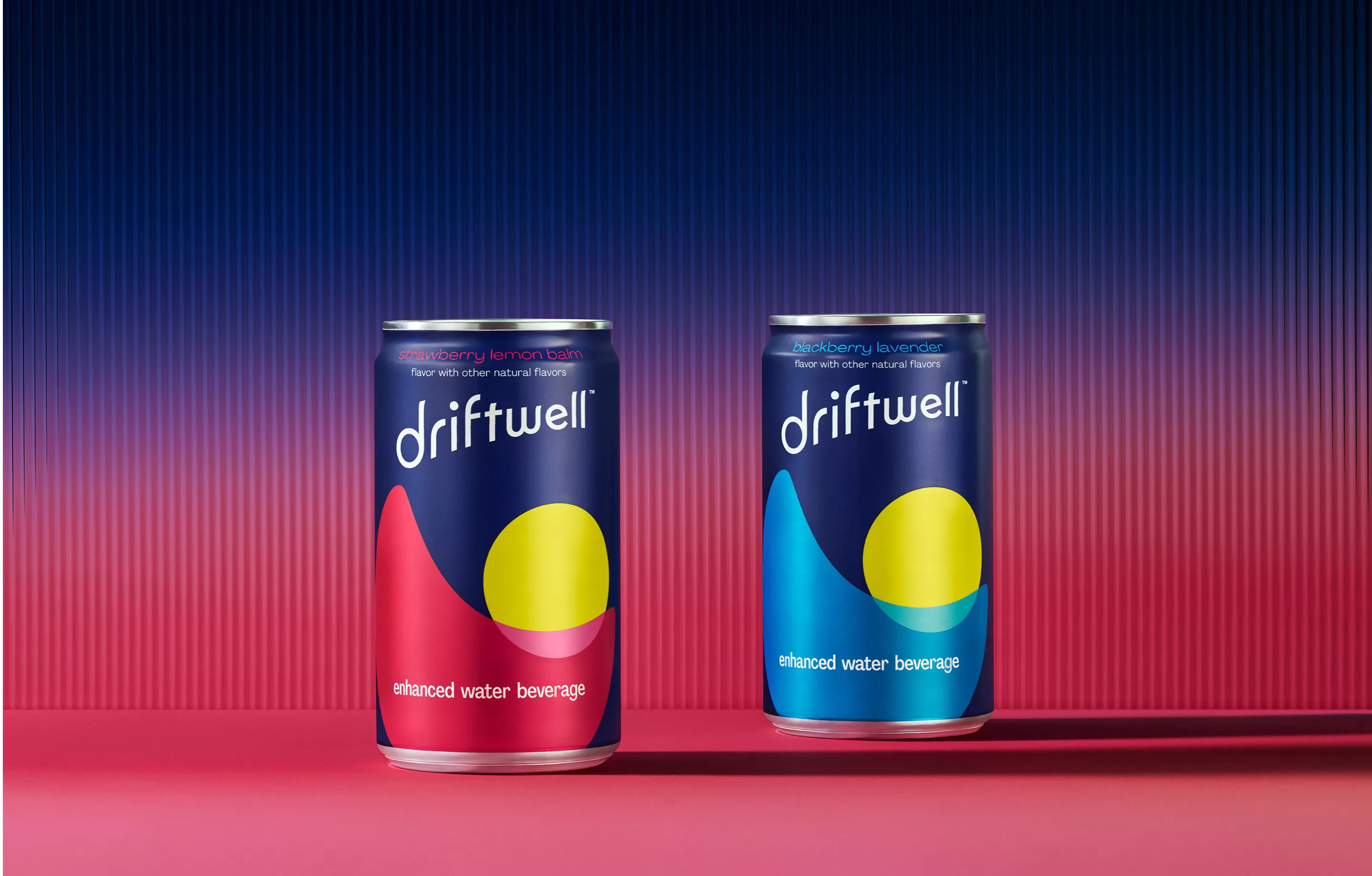
Images of https://design.pepsico.com/case-studies/driftwell
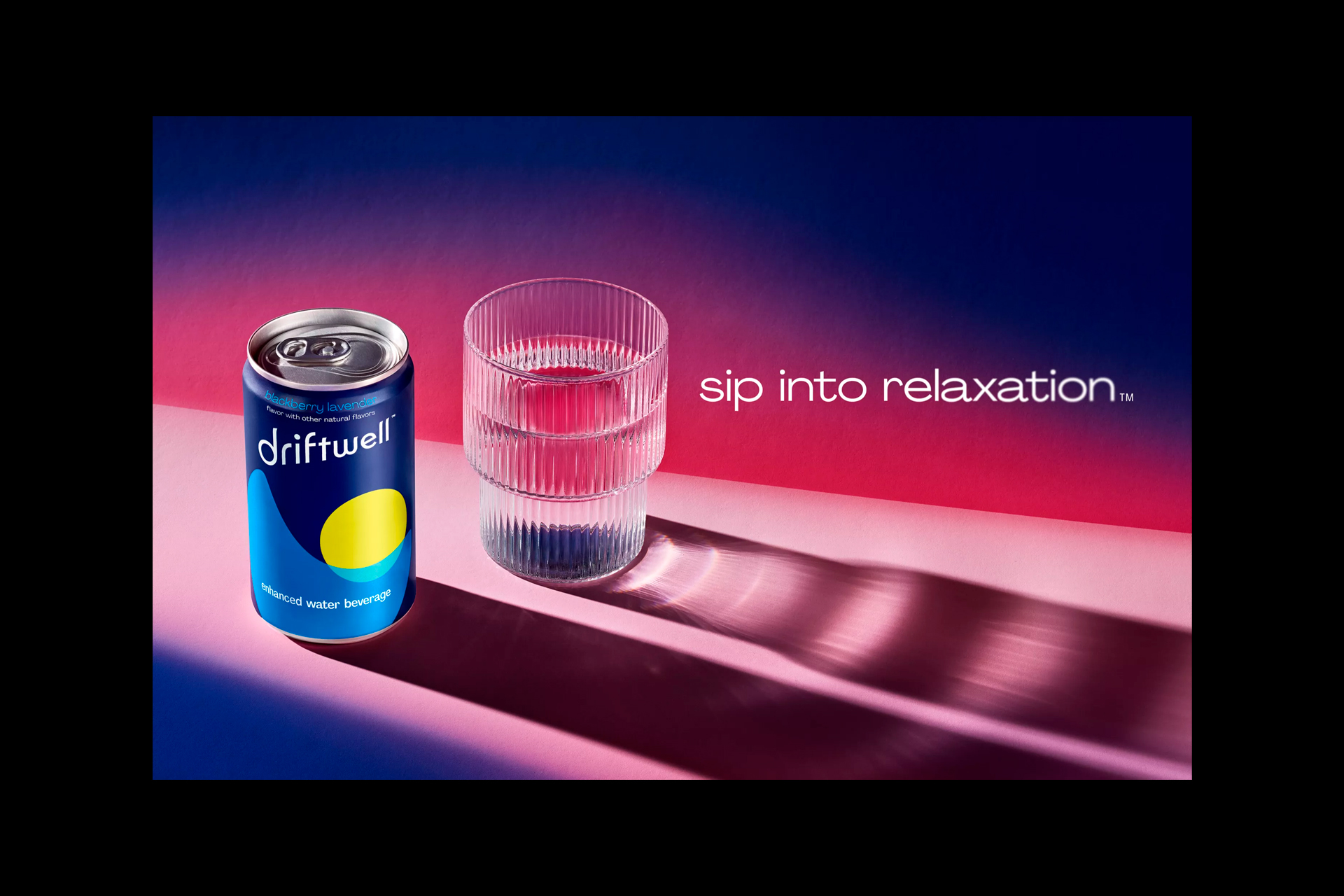
Late last year, PepsiCo entered the functional food market with Driftwell, an “enhanced water beverage” that contains L-theanine and magnesium. Driftwell’s branding features an inky blue background and yellow accents, with an abstract moon dipping into a wave. PepsiCo’s design senior manager Matthew Buchwach and Ange Luke, design and innovation director of North America beverages, describe the Driftwell brand as “quiet,” a careful balance of “commerciality and differentiation.” The Driftwell looks like a Pepsi product in some ways (a central circle, rounded edges) but has a polished, modern asymmetry not usually found in traditional soft drink design.
The word “sleep” does not appear on Driftwell’s packaging, but it doesn’t have to. The visual language of somnolence and its associated products and rituals has become ingrained enough in the past decade for consumers to know that a dark blue or purple product with neutral accents probably has something to do with winding-down. ZzzQuil first appeared on shelves in 2012 and used a deep purple in its design instead of dark blue, likely as a way to differentiate the sleep aid from their blue and green Vicks line.